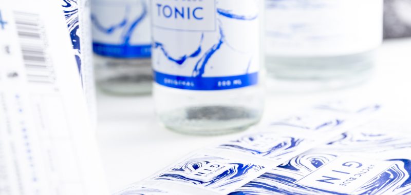
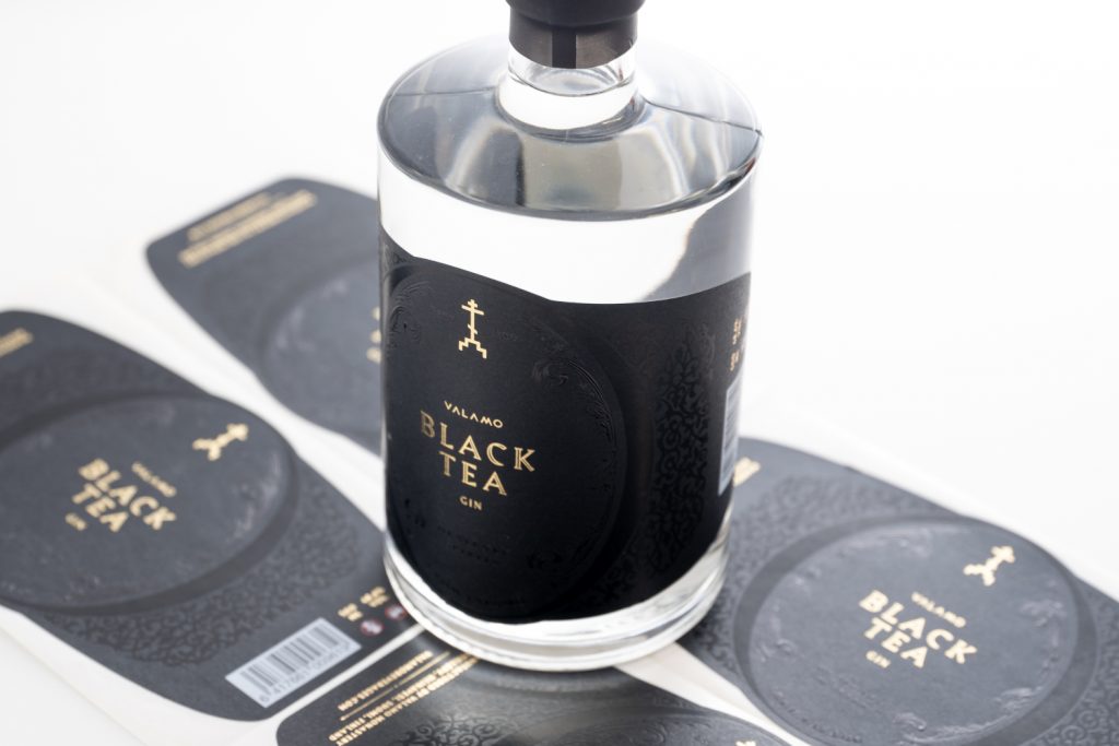
Labels are an essential part of building a product brand. The labels of Arctic Blue Beverages and its sister company Valamo Beverages are of the highest possible quality thanks to careful design and Starcke’s meticulous finishing touches.
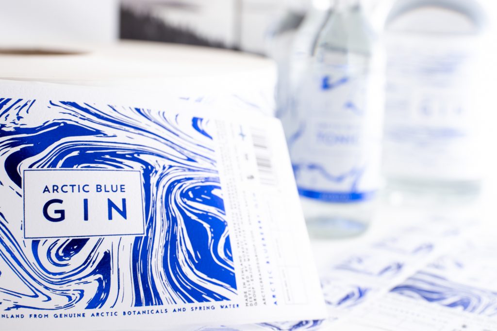
Arctic Blue Beverages’ and its internationally prize-winning gin’s message can be summarized thusly: “Less is more. Quality is everything.”
– We want to offer only the best to our customers. We won’t stop until we’re completely satisfied with our product, explains Toni Eurasto, business development manager at Arctic Blue Beverages.
Naturally, only the best labels are good enough for this business philosophy.
Label design is a three-way cooperation
The labels for both Arctic Blue Beverages and Valamo Beverages were created by designer Emil Peltonen. However, he doesn’t wish to take all credit for them.
– Starcke has always been with me during the design process, at the latest when we’ve began designing the implementation of labels. This has included going over the possibilities and limitations of labels and discussing various options for creating them. Starcke has provided valuable information and professional insight for this part of the process. Starcke has taught me lots about materials and possibilities, praises Peltonen.
According to Eurasto, the design process has been a seamless three-way cooperation.
– I brief Emil and he consults Starcke regarding new label designs. I usually also discuss with Starcke’s people about whether the designs are viable technically and schedule-wise.
Eurasto praises Starcke on its customer-focused and friendly service.
– Starcke has the will and ability to determine the best materials and finishing methods for each customer. They suggest how each plan should be carried out. That saves us lots of time and money. Most importantly, working with Starcke is like working with friends – they have an amicable approach to work. Even though they’re in Eura, it feels like they’re with us in our daily work.
Designing labels is a long process
Peltonen says that he begins the design process of each label by searching for inspiration from the product’s story.
– Arctic Blue Beverages’ products are inspired by nature – its various shapes and colours. The labels’ abstract style leaves a lot up to interpretation. The inspiration for Valamo’s labels came from the Valamo monastery and its surroundings.
Building a brand is the sum total of numerous skilled individuals.
Both brands’ labels make use of different coloured foil work.
– I am especially satisfied with the quality of labels whose material choices have been just right. They show planning and meticulous work, says Peltonen.
Eurasto says he was surprised by how complicated designing a label can be.
– Designing and manufacturing quality labels is a challenging process that takes time. That’s why I definitely recommend getting a skilled team and holding on to a good one after finding them! Building a brand is the sum of numerous skilled individuals.
Want to finish your products
with quality labels?